


UX CASE STUDY
The evolution of a customer-centric approach. How might we provide customers with what they want, not what we think they want.
The evolution of a customer-centric approach. How might we provide customers with what they want, not what we think they want.
For over ten years, Intygrate has been successfully consulting and developing software for a range of high profile clients. As an established service provider, the move into on-demand software or SaaS (Software as a Service) was a major development in the companies growth. So incorporating these two factors were key to Intygrate’s evolution.
How might we provide reliable, accessible services and products in ONE place for potential customers?
The challenge now was to develop the Intygrate company website and censorREACT in tandem. Previously intygrate had two separate sites, one for their services and another for products. CensorREACT is an intelligent filtering and moderation tool to protect and manage the complexity of user-generated content.
With an ambitious redesign of the company website and development of censorREACT product, the two would need to be developed in tandem. Also, because Intygrate has several products in the pipeline, any design solution would need to be scalable.
My role
– UX Design and Design Audit
– Competitive Analysis
– User Research
– Facilitation and Stakeholder Management
– Usability Testing
– Persona Sets
– Customer journey maps
– User Stories
– Company Rebrand
– Content Writing
– High and Low Fidelity Prototyping
– Design System and UI Design
The separation of two sites, services from product was confusing for the user. Rebranding and alignment of the two sites for consistency of brand would be ideal. This would be essential if services and products are to be aligned. But keep our assumptions at bay, test to make sure this is correct.
The suggestion of combining the two sites to make a third… Mixing two brands does not necessarily make a third better, that’s why in my opinion a company rebrand would be the better option.
The old site (see above image) had several elements that stood out from the start:
– No clear CTA (call to action). Better use of the area. Suggest designing a ‘call to action’ or product listing.
– Imagery used on the site was confusing, misleading, and irrelevant to the user.
– Confusing main navigation, suggest moving navigation to the top of page and restructuring with a different focus.
– About us, could be moved to another part of the page, suggest replacing it with product offers or placing a better ‘call to action’ area.
– What we do, vertical navigation versus horizontal navigation, this I feel for the user is confusing. Suggest breaking up these sections into individual scroll down areas.
– Icons used are not consistent with the top navigation. Suggest making icons bigger with a link to each section and moving to more of a horizontal layout
– News could be more dynamic with section windows and click on to learn more.
– Contact us; the map is not easy to use the address details could be condensed and given more space.
– Unoriginal design, the UI design of the site had no personality and lacked visual hierarchy.
The plan was to assume nothing but validate as many of these assumptions as possible, keeping an open and curious mind would help us understand who we are designing for.
Starting point
My goal as the lead UX Designer on this project was to make sure that no stone was left unturned. Most importantly, early involvement of all stakeholders was essential to its success. With that in mind, I facilitated initial brainstorming, problem framing and MVP workshops to achieve alignment with all developers and decision-makers.
Empathy
Understand who our users are, what are their needs and pain points? Can we deliver this in a product or service? Always remember, we never design for ourselves and assume nothing.
Research and Analysis
Focus on understanding user behaviours, needs and motivations. When gathering information from internal stakeholders be aware of bias and assumptions.
“Supposing is good, finding out is better”. Mark Twain
Competitive Analysis
What are others doing that we are missing, and is that right for us?
My hypothesis for better user experience was to make it easy for the user to find the information they need and fast. Also give the user more than one way to get to any one place on the site, with multiple CTA (call to action) and touch-points.
Be Open
Be open to other ideas, big ideas. As a designer, we are ‘problem solvers’ so more voices are better than one, get early collaboration on the solution and alignment from all stakeholders. Again early involvement is essential to our success. Be open to hard questions and ambiguity.
Development
Once we had a clear way forward, from user research, competitive analysis, problem framing and MVP workshops could we get stakeholder agreement on initial information architecture. From these findings sketch concepts, followed by low fidelity prototypes.
In an ideal world, no high fidelity prototypes would be produced until all content is developed and approved. But often is the case that people see what they want by seeing what they don't. So I regularly engaged stakeholders, every few iterations to guide updates and tweaks.
Often overlooked, sketches are fast, cheap and easy ways to get stakeholder agreement. Early involvement and agreement from all parties will eliminate costly misunderstandings, taking them along for the ride gives decision-makers ownership. Then you don’t have to sale your concept or solution, as approval has already been given.
Deliver & Test
Working closely with developers from the start made for a seamless transition to dev stage, with high fidelity prototypes and comprehensive design systems being created. But also close consultation to ensure all elements are validated and aligned.
Research had been done in the past but mostly on the quantitative side. What we didn’t know were the users' motivations and feelings, the qualitative. So an update was needed, this I hoped would give us a better understanding of the questions we needed to ask.
Most importantly, I wanted to be sure of our hypothesis. Were we heading in the right direction? With this answered, we felt with the assurance we could quickly move to the next steps.
Summarising the research and insights gained, I have developed the following considerations:
– The user needs to have all the information required to make a decision.
– Confusion between services and product, both require a different strategy to onboard customers.
– Personas identified are different for services and product, but sometimes overlap.
– UI could be improved, made more user-centred.
“Never go into user research to prove a point, and never create goals that seek to justify a position or reinforce a perspective.
The process should aim to uncover what people really want and how they really are, not whether an opinion (whether yours or a stakeholder) is correct.” Mike Kuniavsky.
With vital insights gain from the research I wanted to get agreement on the basic structure of the site. Referring back to our ‘problem statement’ the rationale was to make the information as accessible as possible. The goal was to keep the site as close to a ‘one-page’ website, keeping all information easy to obtain. Also having the IA front and centre helps keep us on target.
Conducting workshops with key stakeholders ensured that iterations could be applied fast and with little disruption to the deadline. Collaboration with the development team was essential to the smooth running of this project, also having their valued input into whether or not something is achievable.
Having an open mind and adaptable mindset helped when unforeseen changes came about.
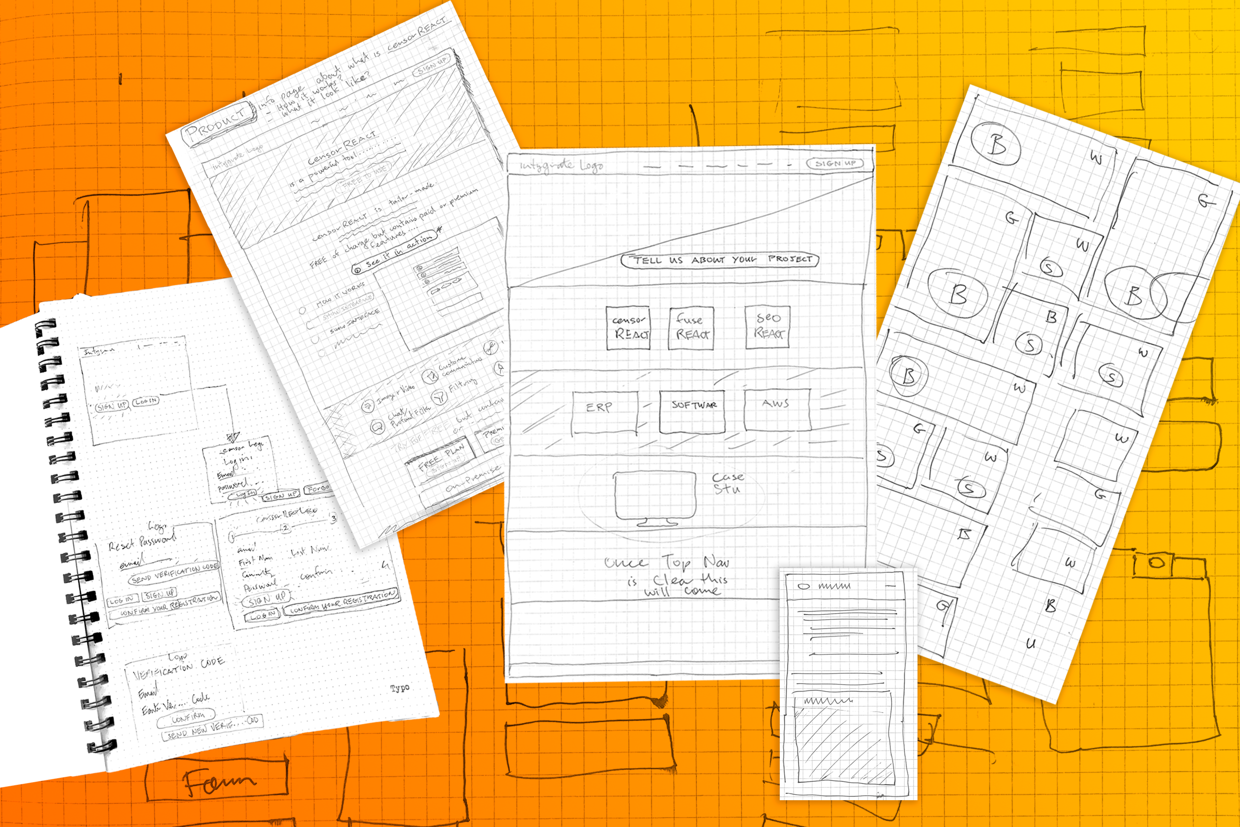
Concept Sketch
Concept sketching allows for fast decision making. With the early involvement of key stakeholders, problems are solved before it can affect the developer at Dev stage. Also, there are no surprises for the decision-makers.
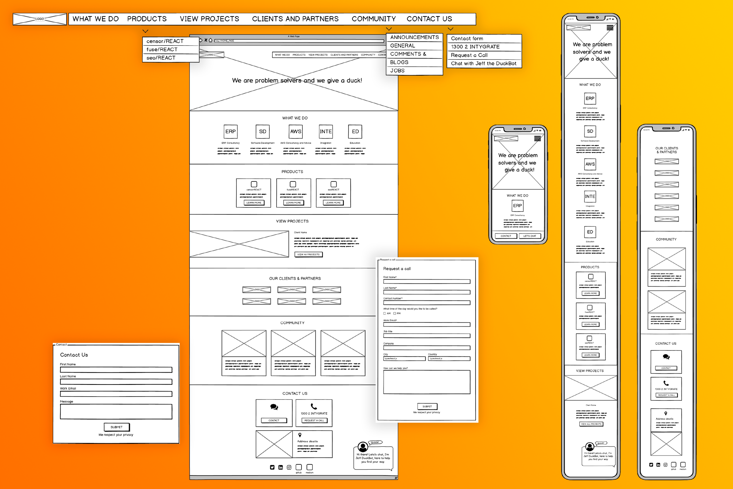
Low fidelity prototypes make the backbone of any project like this. Only when content is placed and agreed upon in the low fidelity design should you move to high fidelity. Then well-developed master components can be handed over to the developer. Collaboration with the Dev team had started way before this. It was not the first time they have seen the designs; involvement from the start is essential.
When designing low or high fidelity, wireframes ‘mobile-first’ approach will help when laying in content, as it is always easier to scale up from mobile to desktop. It is much harder the other way around, creating complicated redesigns which you would have to fit back into mobile anyway.
By becoming ingrained within the team, solving complex problems was a collaborative process, iterations could be applied fast, solutions seen and tested to ensure that we keep the end-user in mind. Also, with software being developed at the same time, this added another layer of complexity. Keeping both sides of the business, product and service involved and designed was vital.
Click on the link below to see it in action.
intygrate